
Back in 2014, my colleague João Martinho (now at the C&A Foundation) and I got a warm reception to our poster on network analysis at the annual American Evaluation Association conference. This year, Stephanie Evergreen even honored us by including it as an of good practice in her new book on data visualization. Below are some quick, biased musings on what made the whole thing really gel as a communication instrument.

(Here’s a larger pdf of this poster: Network Analysis on a Shoestring_AEA2014)
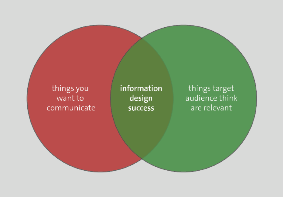
First, we were guided by a simple principle: understand what the target audience considers relevant and where this overlaps with that which we desire to communicate.
We organized the content in three blocks:
Orientation: what are we talking about and for whom is it relevant?
Who are you? The target audience – for whom we thought the content would be useful – because poster content is never relevant for everyone.
How do you collect data? We wanted to at least orient the audience to the range of types of data which could be fed into this tool.
Why would you use this tool? This box attempts to correct two common misconceptions: (a) that network analysis is only useful to map relationships between people, and (b) that producing a network visualization is the end of the process. The latter misconception inspires complaints that network analysts often produce attractive visualizations with little to no interesting interpretations.
Main Message: what are the basic steps of using this tool?
This block leads the reader through a tutorial on the main steps of using NodeXL emphasizing simplicity – in four steps NodeXL transforms raw data into a visualization. The section should display sufficient information to a solitary reader, but during the poster session itself at AEA we had one of the authors present with a laptop so anyone interested could play with a real dataset themselves as a way of reducing some of the mental entry barriers to starting to use the software.
Examples/inspiration: The final block presents some concrete examples which illustrate the insights which network visualization (alone – even without the calculation of statistics) can supply.
Focus on content first.
The choice of a design tool should come after you can clearly articulate what you want to communicate and how this information is relevant to the target audience. Think about the gap you are trying to fill in the readers’ mind, and research how others communicated similar content. Second, as the design comes together, be strict about following the standard bank of recommendations about visual communication (less text, leave empty space, help the reader with cues about where their eye should go next). Once you have thoroughly thought through these aspects, the design should pretty much draw itself.